Café and coffee store in Toronto
Café and coffee store in Toronto
Café and coffee store in Toronto
Café and coffee store in Toronto
Café and coffee store in Toronto
Café and coffee store in Toronto
Ethica
Ethica
Ethica
Ethica
Ethica
Ethica
Ethica

Café and specialty coffee store Ethica Coffee Roasters, based in Toronto, sources, roasts, and serves high-quality beans with a focus on transparency, origin, and ethical production.
Café and specialty coffee store Ethica Coffee Roasters, based in Toronto, sources, roasts, and serves high-quality beans with a focus on transparency, origin, and ethical production.
Café and specialty coffee store Ethica Coffee Roasters, based in Toronto, sources, roasts, and serves high-quality beans with a focus on transparency, origin, and ethical production.
Café and specialty coffee store Ethica Coffee Roasters, based in Toronto, sources, roasts, and serves high-quality beans with a focus on transparency, origin, and ethical production.
Café and specialty coffee store Ethica Coffee Roasters, based in Toronto, sources, roasts, and serves high-quality beans with a focus on transparency, origin, and ethical production.
Café and specialty coffee store Ethica Coffee Roasters, based in Toronto, sources, roasts, and serves high-quality beans with a focus on transparency, origin, and ethical production.
Café and specialty coffee store Ethica Coffee Roasters, based in Toronto, sources, roasts, and serves high-quality beans with a focus on transparency, origin, and ethical production.
Objective
Objective
Objective
Objective
Objective
Objective
Objective
To design labels that will stand out against the interior and reflect location of the store.
To design labels that will stand out against the interior and reflect location of the store.
To design labels that will stand out against the interior and reflect location of the store.
To design labels that will stand out against the interior and reflect location of the store.
To design labels that will stand out against the interior and reflect location of the store.
To design labels that will stand out against the interior and reflect location of the store.
To design labels that will stand out against the interior and reflect location of the store.
What Was Done
What Was Done
What Was Done
What Was Done
What Was Done
What Was Done
What Was Done
Labels
A set of icons for flavor notes
Sketchbooks
T-shirts
Shopping bags
Baseball hats
Scotch tape
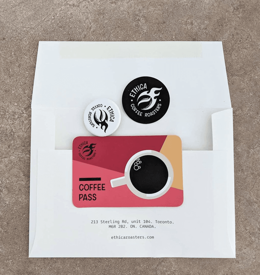
Subscription cards for coffee
Labels for collaborations
Labels
A set of icons for flavor notes
Sketchbooks
T-shirts
Shopping bags
Baseball hats
Scotch tape
Subscription cards for coffee
Labels for collaborations
Labels
A set of icons for flavor notes
Sketchbooks
T-shirts
Shopping bags
Baseball hats
Scotch tape
Subscription cards for coffee
Labels for collaborations
Labels
A set of icons for flavor notes
Sketchbooks
T-shirts
Shopping bags
Baseball hats
Scotch tape
Subscription cards for coffee
Labels for collaborations
Labels
A set of icons for flavor notes
Sketchbooks
T-shirts
Shopping bags
Baseball hats
Scotch tape
Subscription cards for coffee
Labels for collaborations
Labels
A set of icons for flavor notes
Sketchbooks
T-shirts
Shopping bags
Baseball hats
Scotch tape
Subscription cards for coffee
Labels for collaborations
Labels
A set of icons for flavor notes
Sketchbooks
T-shirts
Shopping bags
Baseball hats
Scotch tape
Subscription cards for coffee
Labels for collaborations
Release
Release
Release
Release
Release
Release
Release
2018
2018
2018
2018
2018
2018
2018
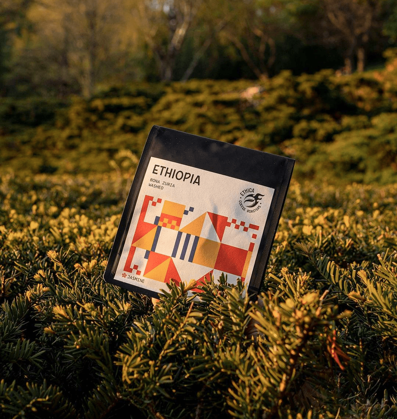

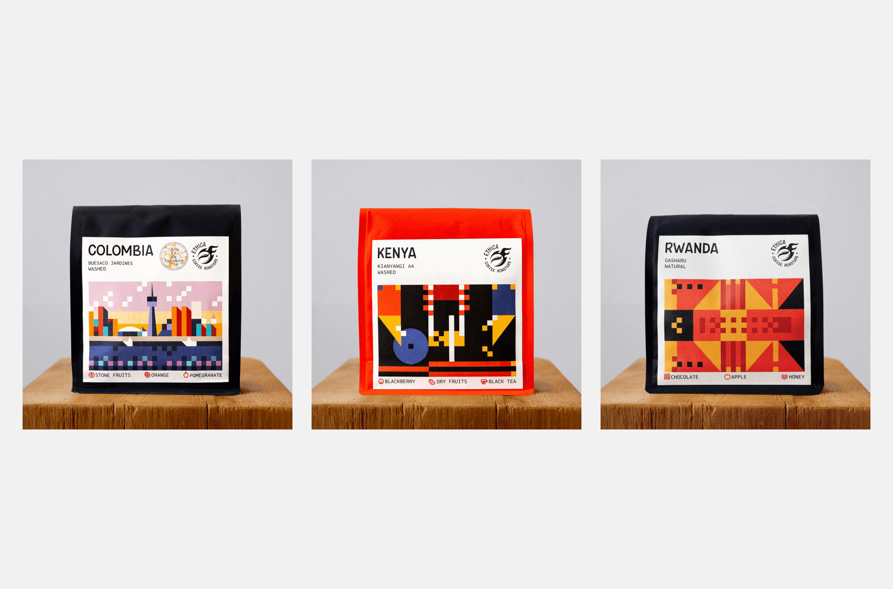
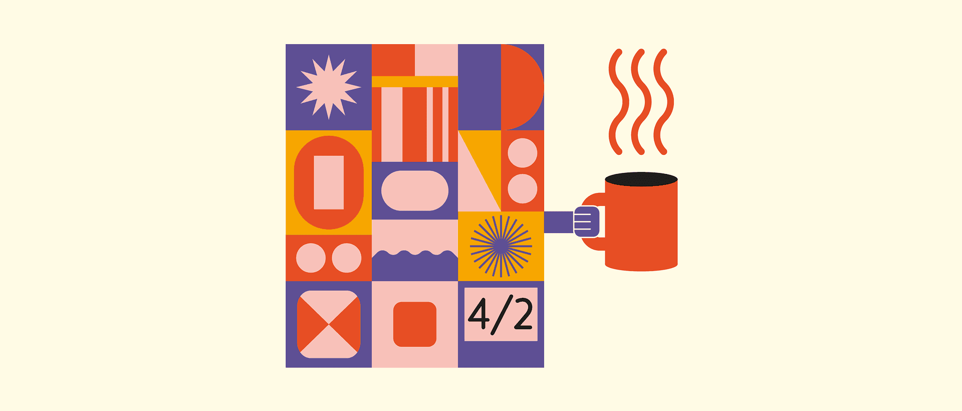
Airborne Ape responded with a Bauhaus-inspired aesthetic, utilizing three vibrant color bands to create a radiant and modern visual identity. This design approach was applied across various brand materials, including labels, sketchbooks, apparel, and subscription cards, ensuring a cohesive and striking brand presence.
Airborne Ape responded with a Bauhaus-inspired aesthetic, utilizing three vibrant color bands to create a radiant and modern visual identity. This design approach was applied across various brand materials, including labels, sketchbooks, apparel, and subscription cards, ensuring a cohesive and striking brand presence.
Airborne Ape responded with a Bauhaus-inspired aesthetic, utilizing three vibrant color bands to create a radiant and modern visual identity. This design approach was applied across various brand materials, including labels, sketchbooks, apparel, and subscription cards, ensuring a cohesive and striking brand presence.
Airborne Ape responded with a Bauhaus-inspired aesthetic, utilizing three vibrant color bands to create a radiant and modern visual identity. This design approach was applied across various brand materials, including labels, sketchbooks, apparel, and subscription cards, ensuring a cohesive and striking brand presence.
Airborne Ape responded with a Bauhaus-inspired aesthetic, utilizing three vibrant color bands to create a radiant and modern visual identity. This design approach was applied across various brand materials, including labels, sketchbooks, apparel, and subscription cards, ensuring a cohesive and striking brand presence.
Airborne Ape responded with a Bauhaus-inspired aesthetic, utilizing three vibrant color bands to create a radiant and modern visual identity. This design approach was applied across various brand materials, including labels, sketchbooks, apparel, and subscription cards, ensuring a cohesive and striking brand presence.
Airborne Ape responded with a Bauhaus-inspired aesthetic, utilizing three vibrant color bands to create a radiant and modern visual identity. This design approach was applied across various brand materials, including labels, sketchbooks, apparel, and subscription cards, ensuring a cohesive and striking brand presence.
To enhance the customer experience, a set of 20 custom icons representing different flavor notes was developed, providing an intuitive guide to the coffee's taste profiles. Collaborations with local entities, such as the Coffee Toronto blog and Henderson Brewing Company, were seamlessly integrated into the brand's visual language.
To enhance the customer experience, a set of 20 custom icons representing different flavor notes was developed, providing an intuitive guide to the coffee's taste profiles. Collaborations with local entities, such as the Coffee Toronto blog and Henderson Brewing Company, were seamlessly integrated into the brand's visual language.
To enhance the customer experience, a set of 20 custom icons representing different flavor notes was developed, providing an intuitive guide to the coffee's taste profiles. Collaborations with local entities, such as the Coffee Toronto blog and Henderson Brewing Company, were seamlessly integrated into the brand's visual language.
To enhance the customer experience, a set of 20 custom icons representing different flavor notes was developed, providing an intuitive guide to the coffee's taste profiles. Collaborations with local entities, such as the Coffee Toronto blog and Henderson Brewing Company, were seamlessly integrated into the brand's visual language.
To enhance the customer experience, a set of 20 custom icons representing different flavor notes was developed, providing an intuitive guide to the coffee's taste profiles. Collaborations with local entities, such as the Coffee Toronto blog and Henderson Brewing Company, were seamlessly integrated into the brand's visual language.
To enhance the customer experience, a set of 20 custom icons representing different flavor notes was developed, providing an intuitive guide to the coffee's taste profiles. Collaborations with local entities, such as the Coffee Toronto blog and Henderson Brewing Company, were seamlessly integrated into the brand's visual language.
To enhance the customer experience, a set of 20 custom icons representing different flavor notes was developed, providing an intuitive guide to the coffee's taste profiles. Collaborations with local entities, such as the Coffee Toronto blog and Henderson Brewing Company, were seamlessly integrated into the brand's visual language.


Up next…
Up next…
Up next…
Up next…
Up next…
Up next…
Up next…

Aesthetic medicine clinic
Aesthetic medicine clinic
Aesthetic medicine clinic
Aesthetic medicine clinic
Aesthetic medicine clinic
L’ART
L’ART
L’ART
L’ART
L’ART
Chain of coffee houses
Chain of coffee houses
Chain of coffee houses
Chain of coffee houses
Chain of coffee houses
Praktika Coffee
Praktika Coffee
Praktika Coffee
Praktika Coffee
Praktika Coffee