Olive oil
Olive oil
Olive oil
Olive oil
Olive oil
Olive oil
Mamontov
Mamontov
Mamontov
Mamontov
Mamontov
Mamontov
Mamontov

High-end early cold-pressed Greek olive oil with a strong aroma and flavor.
High-end early cold-pressed Greek olive oil with a strong aroma and flavor.
High-end early cold-pressed Greek olive oil with a strong aroma and flavor.
High-end early cold-pressed Greek olive oil with a strong aroma and flavor.
High-end early cold-pressed Greek olive oil with a strong aroma and flavor.
High-end early cold-pressed Greek olive oil with a strong aroma and flavor.
High-end early cold-pressed Greek olive oil with a strong aroma and flavor.
Objective
Objective
Objective
Objective
Objective
Objective
Objective
To design a visual identity with a coat of arms that doubles as a logo for the Mamontov Bazaar brand.
To design a visual identity with a coat of arms that doubles as a logo for the Mamontov Bazaar brand.
To design a visual identity with a coat of arms that doubles as a logo for the Mamontov Bazaar brand.
To design a visual identity with a coat of arms that doubles as a logo for the Mamontov Bazaar brand.
To design a visual identity with a coat of arms that doubles as a logo for the Mamontov Bazaar brand.
To design a visual identity with a coat of arms that doubles as a logo for the Mamontov Bazaar brand.
To design a visual identity with a coat of arms that doubles as a logo for the Mamontov Bazaar brand.
What Was Done
What Was Done
What Was Done
What Was Done
What Was Done
What Was Done
What Was Done
Coat of arms
Visual identity
Brand book
Packaging
Brochure
Business cards
Website
Coat of arms
Visual identity
Brand book
Packaging
Brochure
Business cards
Website
Coat of arms
Visual identity
Brand book
Packaging
Brochure
Business cards
Website
Coat of arms
Visual identity
Brand book
Packaging
Brochure
Business cards
Website
Coat of arms
Visual identity
Brand book
Packaging
Brochure
Business cards
Website
Coat of arms
Visual identity
Brand book
Packaging
Brochure
Business cards
Website
Coat of arms
Visual identity
Brand book
Packaging
Brochure
Business cards
Website
Release
Release
Release
Release
Release
Release
Release
2018
2018
2018
2018
2018
2018
2018
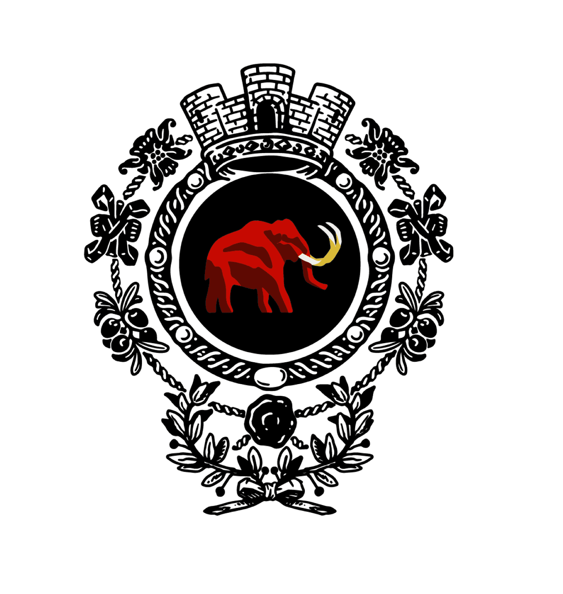

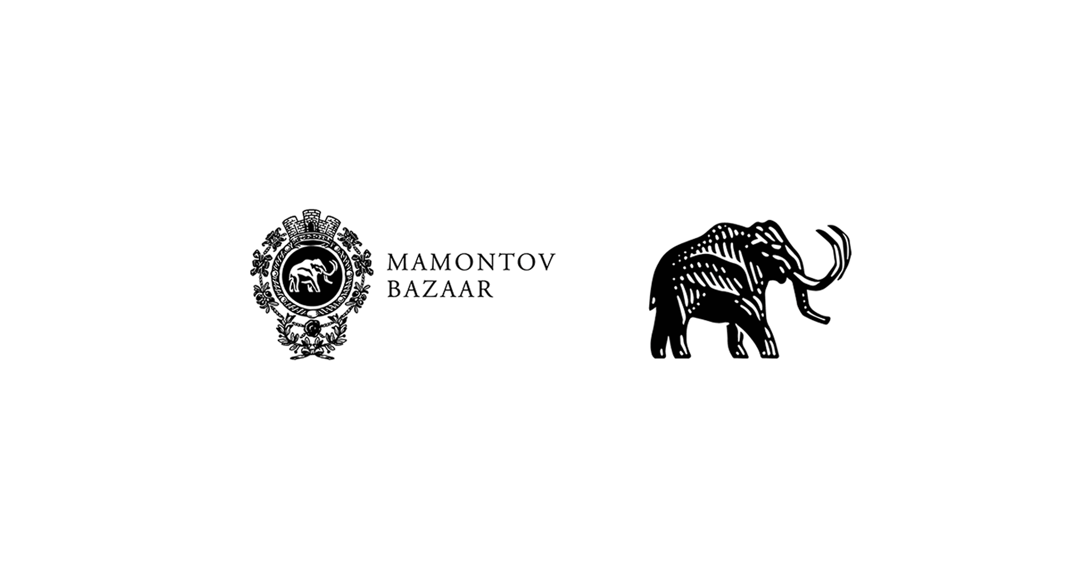
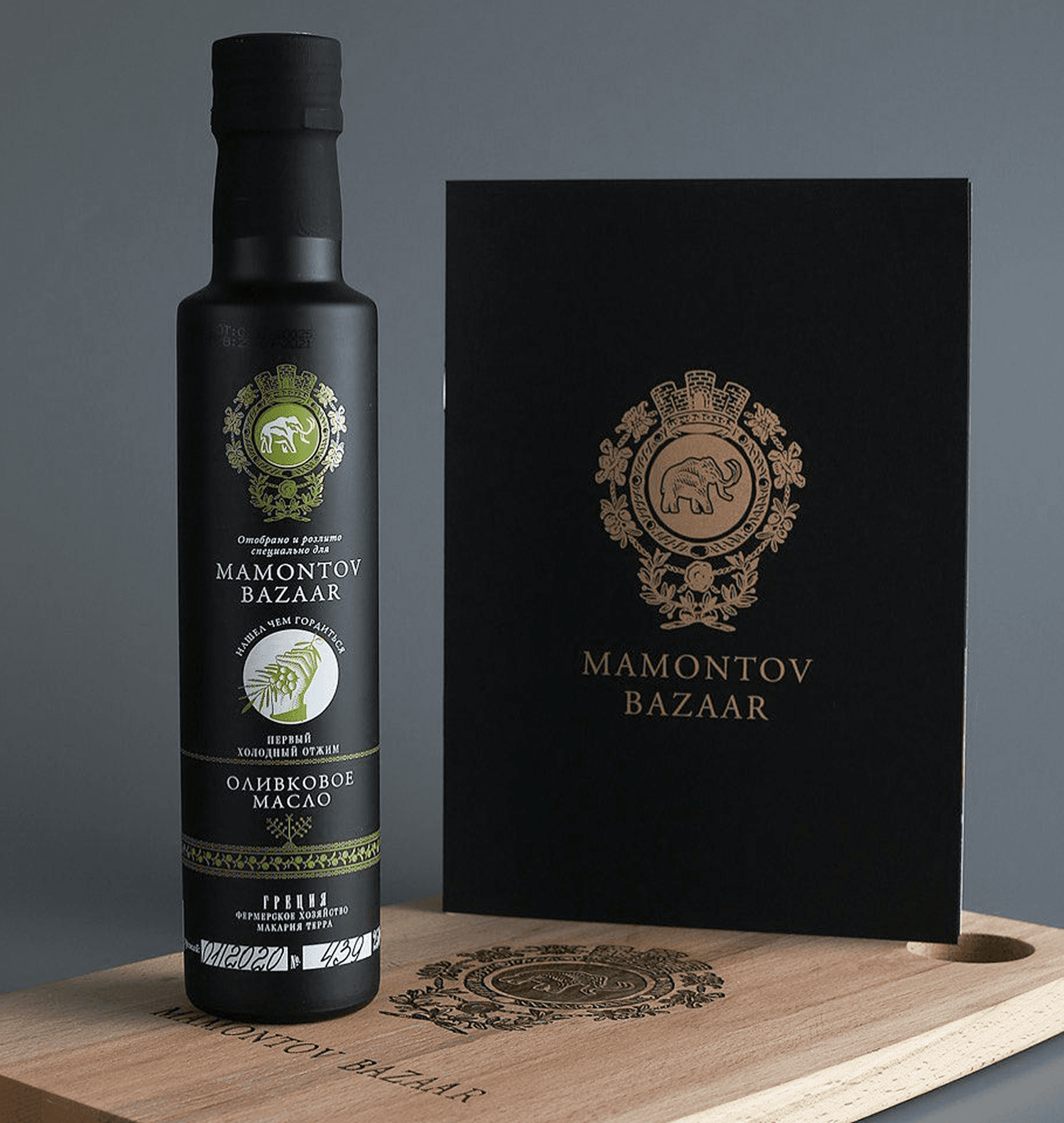
The brand’s founder Mikhail Mamontov wanted to emphasize the classical motifs and continuity, which is why a coat of arms was chosen as the product’s logo. In designing it, we derived inspiration from 19th century French coats of arms. Instead of the order’s traditional chain, Mamontov Bazaar coat of arms has the entwined olive branches.
The brand’s founder Mikhail Mamontov wanted to emphasize the classical motifs and continuity, which is why a coat of arms was chosen as the product’s logo. In designing it, we derived inspiration from 19th century French coats of arms. Instead of the order’s traditional chain, Mamontov Bazaar coat of arms has the entwined olive branches.
The brand’s founder Mikhail Mamontov wanted to emphasize the classical motifs and continuity, which is why a coat of arms was chosen as the product’s logo. In designing it, we derived inspiration from 19th century French coats of arms. Instead of the order’s traditional chain, Mamontov Bazaar coat of arms has the entwined olive branches.
The brand’s founder Mikhail Mamontov wanted to emphasize the classical motifs and continuity, which is why a coat of arms was chosen as the product’s logo. In designing it, we derived inspiration from 19th century French coats of arms. Instead of the order’s traditional chain, Mamontov Bazaar coat of arms has the entwined olive branches.
The brand’s founder Mikhail Mamontov wanted to emphasize the classical motifs and continuity, which is why a coat of arms was chosen as the product’s logo. In designing it, we derived inspiration from 19th century French coats of arms. Instead of the order’s traditional chain, Mamontov Bazaar coat of arms has the entwined olive branches.
The brand’s founder Mikhail Mamontov wanted to emphasize the classical motifs and continuity, which is why a coat of arms was chosen as the product’s logo. In designing it, we derived inspiration from 19th century French coats of arms. Instead of the order’s traditional chain, Mamontov Bazaar coat of arms has the entwined olive branches.
The brand’s founder Mikhail Mamontov wanted to emphasize the classical motifs and continuity, which is why a coat of arms was chosen as the product’s logo. In designing it, we derived inspiration from 19th century French coats of arms. Instead of the order’s traditional chain, Mamontov Bazaar coat of arms has the entwined olive branches.
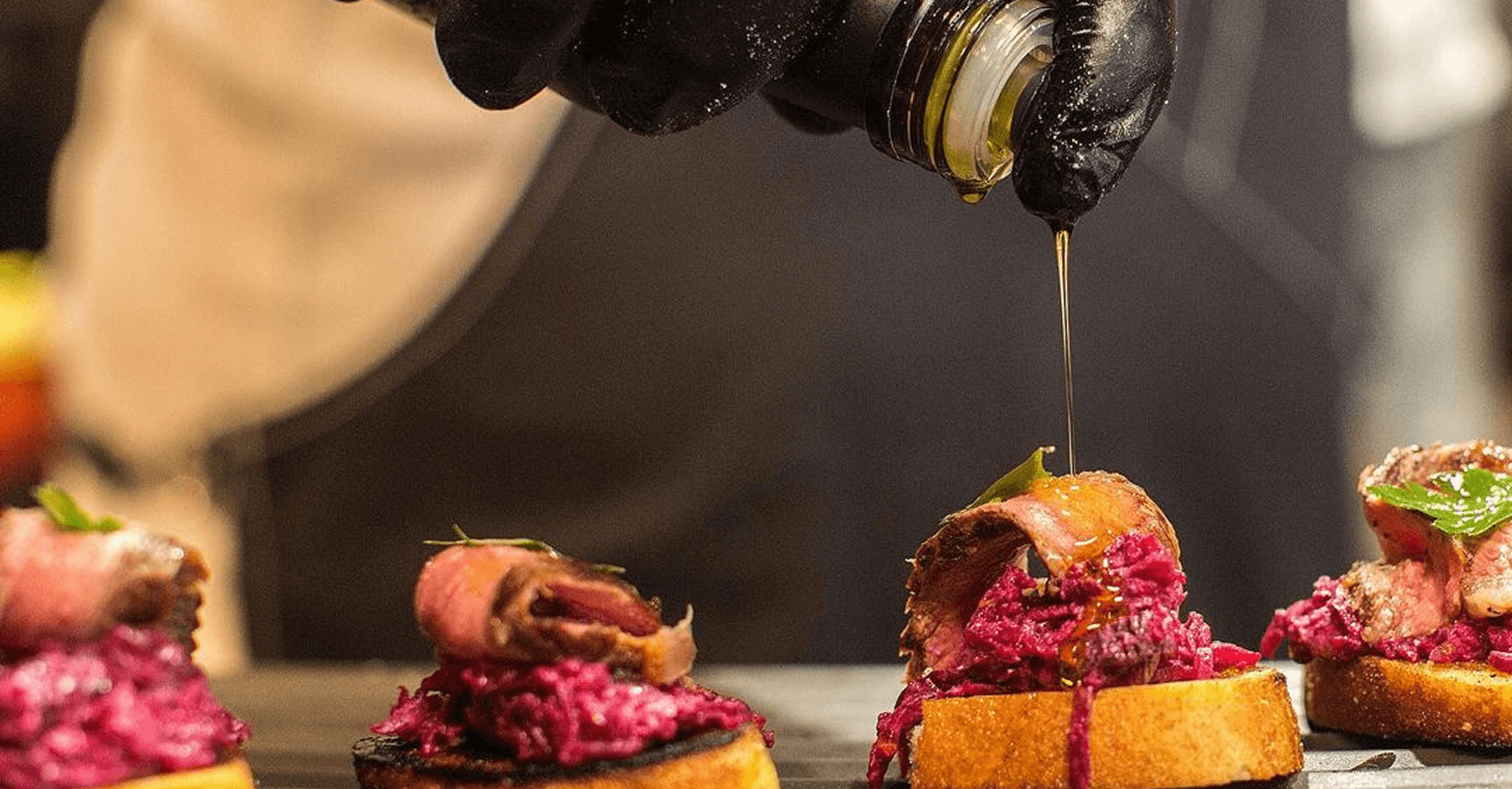
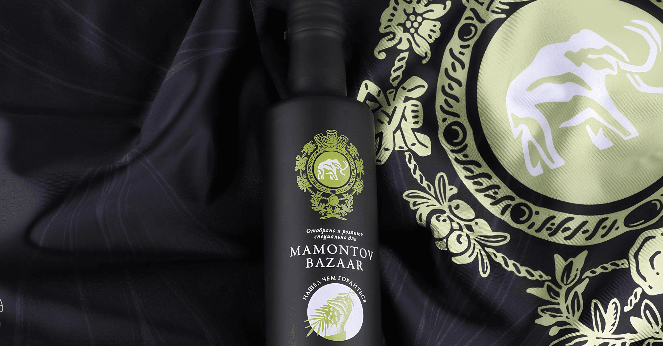
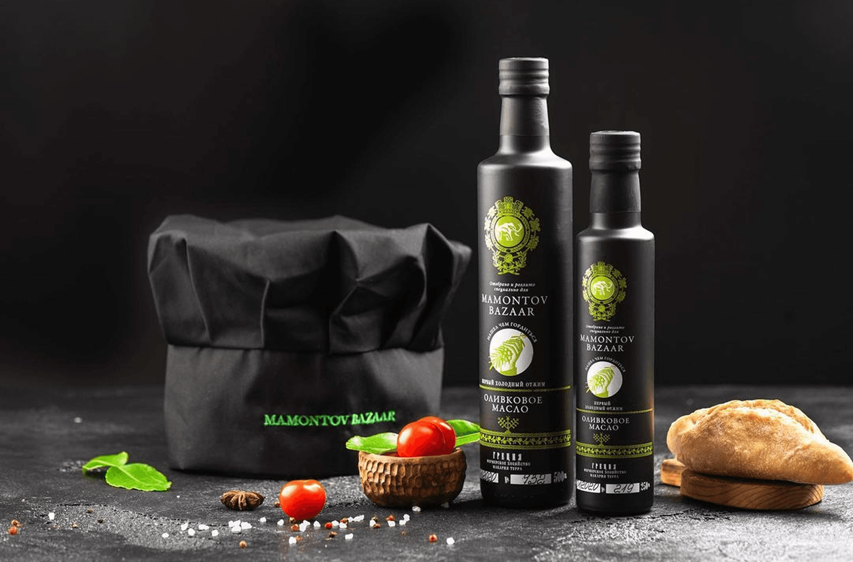
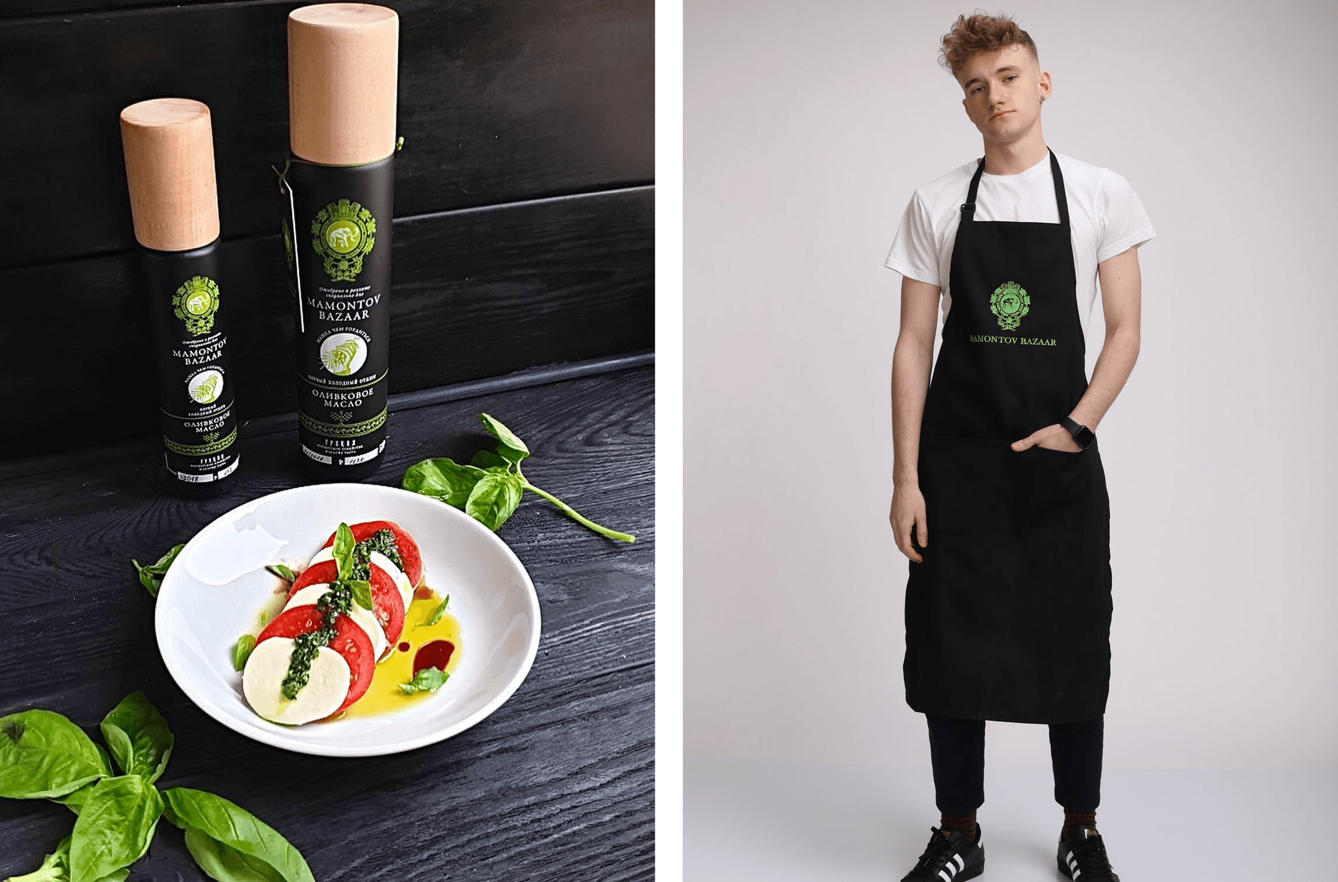
Black opaque bottles are traditional for Greek olive oil. The label, produced by flexographic printing, imitates an engraving. The final touch is the wooden cap that gives the packaging a cylindrical form and looks especially dignified. The brand typefaces English Tea and Fleursdumal were created by the Letterhead Studio.
Black opaque bottles are traditional for Greek olive oil. The label, produced by flexographic printing, imitates an engraving. The final touch is the wooden cap that gives the packaging a cylindrical form and looks especially dignified. The brand typefaces English Tea and Fleursdumal were created by the Letterhead Studio.
Black opaque bottles are traditional for Greek olive oil. The label, produced by flexographic printing, imitates an engraving. The final touch is the wooden cap that gives the packaging a cylindrical form and looks especially dignified. The brand typefaces English Tea and Fleursdumal were created by the Letterhead Studio.
Black opaque bottles are traditional for Greek olive oil. The label, produced by flexographic printing, imitates an engraving. The final touch is the wooden cap that gives the packaging a cylindrical form and looks especially dignified. The brand typefaces English Tea and Fleursdumal were created by the Letterhead Studio.
Black opaque bottles are traditional for Greek olive oil. The label, produced by flexographic printing, imitates an engraving. The final touch is the wooden cap that gives the packaging a cylindrical form and looks especially dignified. The brand typefaces English Tea and Fleursdumal were created by the Letterhead Studio.
Black opaque bottles are traditional for Greek olive oil. The label, produced by flexographic printing, imitates an engraving. The final touch is the wooden cap that gives the packaging a cylindrical form and looks especially dignified. The brand typefaces English Tea and Fleursdumal were created by the Letterhead Studio.
Black opaque bottles are traditional for Greek olive oil. The label, produced by flexographic printing, imitates an engraving. The final touch is the wooden cap that gives the packaging a cylindrical form and looks especially dignified. The brand typefaces English Tea and Fleursdumal were created by the Letterhead Studio.


Up next…
Up next…
Up next…
Up next…
Up next…
Up next…
Up next…

Enthusiastic roasters from Izhevsk
Enthusiastic roasters from Izhevsk
Enthusiastic roasters from Izhevsk
Enthusiastic roasters from Izhevsk
Enthusiastic roasters from Izhevsk
Tasty Coffee
Tasty Coffee
Tasty Coffee
Tasty Coffee
Tasty Coffee

The history of Bezukhov family
The history of Bezukhov family
The history of Bezukhov family
The history of Bezukhov family
The history of Bezukhov family
Genealogical Book
Genealogical Book
Genealogical Book
Genealogical Book
Genealogical Book